![]()
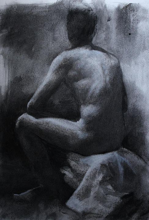
The subject of a demonstration and lecture at The Vancouver Sketch Club Tuesday evening January 15th, 2013. This demonstration of willow charcoal shows how the subject can be realized using a variety of compatible techniques and mediums.
![]()
The subject of a demonstration and lecture at The Vancouver Sketch Club Tuesday evening January 15th, 2013. This demonstration of willow charcoal shows how the subject can be realized using a variety of compatible techniques and mediums.
Life drawing at Basic Inquiry
Willow charcoal heightened with white.
12 x 8 inches
This is a drawing I did in a LWO drawing session with a group of artists here in Vancouver. The Society is a wonderful resource for Vancouver based artists. Here is their link: Basic Inquiry http://www.lifedrawing.org

Oil on panel 9 x 11 inches Oct. 2012
Driving through the Delta region of the Fraser River just before Halloween there was an amazing full moon still hanging in the morning sky. The pumpkin harvest was underway so I pulled off the road to watch. It was a very dry year so as the harvesters drove through the parched fields a great plume of dust soon obscured everything. It reminded me of the fragility of our relationship with the earth. If you look closely in the painting you can just make out a tiny set of headlights peering through the base of the dust cloud.
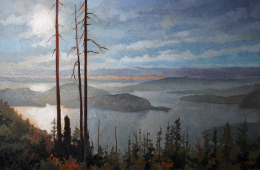
A small painting I did of a view from a hike up Cypress. I love to depict the sublime. If you look closely at the pass to the right of Smuggler’s Cove you can just make out the Langdale Ferry, a mere brushstroke from this vantage point.
The following is a critique and a response to the question of how to lighten or correct a watercolour painting. The artist, Carol Jensen, lives and works in Vancouver, Canada.

Dear Carol,
First of all let me congratulate you on your painting of Dana Point. You have done a great job orchestrating the perspective lines to increase the sense of depth and the distant hills and trees have been treated with a sensitive observation of aerial perspective. The trees have great solidity and you have observed the pull of gravity on the leaf edges. You also have some very pleasing floccuation in the sky. Ultramarine Blue tends to behave this way and the effect is a valued characteristic of watercolour.
You asked me earlier about correcting watercolour. Watercolour can be an unforgiving medium but some erasure is possible. Some pigments are more “staining” than others, also some manufacturers use dispersants which increase the tendency for the pigments to work their way into the grain of the paper. Erasure is best done when the colour is still wet but you can easily re-wet any area. If you have already cut the painting from it’s stretch it will be necessary to re-stretch it as water will make the paper buckle.

 If, for example, you wanted to lift the background area of trees to the left of the subject to create a greater sense of depth, just float a wash of clean water over the area with a clean brush, barely touching the paper with the brush. It is a good idea to have two water containers, clean and not so clean. This way you can make sure that you don’t contaminate the painting with dirty water. Let the water soak in a while and wait a bit for the binder to soften and then push a clean, towelette onto the specific area to lift the colour out. Not all the pigment will come out but you will find everything will lighten while still retaining the form of the brushstrokes. Remember to keep turning the towelette and don’t rub rather push into and lift directly from the paper. You may have to repeat the procedure a couple of times but it should lighten considerably. Be careful not to erase surrounding areas like the edge of the foreground tree.
To give more of a sense of depth reduce some of the hard edges on the shoreline as it passes into the background. Wet just the area you want to erase, as before, and wait for the gum arabic to soften then patiently brush back and forth on the edge while cleaning and rinsing your brush frequently. Don’t flood the area with water but use just enough to dissolve the binder on the edge you want to erase. You can also use your brush, after drying with a paper towel, like a sponge to suck up the water and pigment where you need more control.

I noticed that you have a wonderful division of light and dark on the trunk of the foremost tree and shadow shapes cast by the rocks to the right in the foreground. This gives a strong sense of light but there is no shadow from the tree to explain it’s presence. I have used a cutout shape from your tree and reversed it on the ground to depict a warm gray shadow that curves towards and includes the viewer (Artistic license but there should be some darkening there in nature).
For a wash of this size it would be a good idea to premix a healthy batch of the colour in a container. A small egg cup works well and if it is white it is easier to see the colour you are mixing. Test the wash on a piece of scrap paper before committing to the painting to make sure it has the correct density and that the edge is not going to be too hard. If you use too much water in a wash it might force you to use too much of the wash to get the right value (darkness) which results in a very sharp edge that is outlined by migrating pigment. In this particular case you would want to use a substantial colour thinly, that is you wouldn’t want to flood the page with a very dilute wash that would take too long to absorb into the paper.
 It is technically difficult to do all of this while drawing the perfect edge but take your time, progress at a steady pace and keep recharging your brush as you progress. You will also want to dilute the wash bit by bit as you go so you get a gradual transition of value. While you are at it you could also use the same wash to simplify and reinforce the shadowed side of the tree trunks. It is very subtle but it will give a sense of mystery to your shadows and focus more attention to the lights in that area.
Another note about the shadow. If it were an overcast day the shadow would still be there but would have a very soft edge. As you know a soft edge would need to be laid on wet paper. A spray bottle or atomizer is sometimes useful for re-wetting a specific area without damaging the existing brushstrokes. Be careful not to over-saturate the paper as this may fatigue the more delicate passages.
I have added a dark green to the upper left of the composition that matches the shadows in your trees. I know that the edge will probably be covered with a matte but it doesn’t hurt to have a darker, shadowed side of the tree in any case to balance and contrast the form that you have achieved on the lighter side. It also gives a sense of the composition going out, beyond the edge of the paper which makes the tree look more substantial. Don’t worry about letting your subjects ignore the artificial constraints of your picture plane feel free to let the paint flow over the edges.
Many of the things I have mentioned you obviously know already but thanks for giving me the chance to demonstrate these principles using your painting as an example.
Graham
Dear Graham,
Your feedback is so valuable to me. A big thank you to you. I really appreciate the time & effort you have put into this critique.
I’m at the stage where I’m getting there but still a few aspects are indeed missing with this piece.
1. Dark Shoreline Definition: not sure what I was thinking when I created a strong shoreline definition there. It really benefited from another pair of eyes to see that it wasn’t helping the background fade away into the distance nicely. I get what you are saying about fading it out more. Good point.
2. Foreground shadow of tree: although there was no shadow in the original photo, I love the look of this shadow and it really pulls the composition together for the sake of the picture. (I only hope I can pull off painting an intricate shadow wash.)
3.The dark green foliage in upper left corner: I see more balance to the tree now and it DOES give the tree more height, which is what the tree originally did look like. Another big help to this painting.
4. Fading out the four distant trees: I had never thought of doing that, but it does make sense.
5. Tree wash: this is going to be a bit challenging to control the color from leaking on to the light areas but I will try it. It gives an overall unifying aspect to it.
I welcome the changes you have suggested and look forward to putting those suggestions into it action. I don’t think there’s anything else.
Thank you for explaining ‘how’ to do the wash as well.
This has been a great learning session for me. Graham you’ve been super helpful. I am very keen to step up my painting skills to another level…
Thanks,
Carol
The following is an example of an online critique. I encourage my students to send me examples of their latest work for evaluations. I hope this will help other students with their projects. This recent example is from a summer course on “Painting From Photographs” at the Avenue Road Arts School in Toronto, Canada.
“I was very happy to be painting again and enjoyed your course very much. I am attaching a photo of the first piece I was working on, which I think I have completed. I’d appreciate it if you could critique it so I could improve it or the next one. I am not displeased with it, particularly considering how long it took me to do it and how much time elapsed since I last picked up a brush. I am still working on the second one I started in your class and I’ve also been working on another Paris scene…. Cam”

Cam,
As you have captured the scene with vitality and clarity the following notes are minor adjuncts to a successful painting but you have asked me to critique it so here goes:
Aerial Perspective
You can increase the sense of aerial perspective by adding more of the the sky colour to the distant trees. This will give relief to the nearer trees and make it easier to create a greater sense of depth throughout the painting.

Obnubilation (not the medical definition)
I appreciate that you are keeping your brushstrokes to a minimum and with great effect. I mentioned in class that this type of painting is rather like the old game show called “Name That Tune” where the contestant tries to name a particular song after hearing only the fewest number of notes. This brevity and eloquence is exactly what you have achieved in this essay but if you wanted to add a few more intermediary strokes you could lose even more contrast on the horizon. There are many names for this kind of lost edge, almost as many names as there are types of edges found in nature. Obfuscation, obscuration,etc. but obnubilation, a cloudiness, might be best in this case. Don’t forget to reflect the changes.
Reflections
You have made some great brushstrokes in the reflections of the trees but I think that the actual trees themselves may have become overwhelmed by the sky apertures you painted. It is an interesting idea to change and distort the reflections to, excuse the pun, reflect the mood of the subject but, naturalistically, they should have more similarities than differences. I have duplicated the shapes of the foliage and mirrored them against the sky to create more continuity. These shapes shouldn’t be exactly the same as the reflections, as I have done in the example, but it does serve to illustrate the effect.

You have noted very well that the reflections are less saturated and are generally lighter than what they are reflecting. This is not a general rule. Reflections will take on the aspect of whatever is reflecting them. A bright blue swimming pool is a different mirror than this, more somber, wet pavement. You have also noted that the tops of the trees, when reflected, are almost engulfed by the relatively strong light of the sky. I have adjusted the reflection of the figure to match this observation.

Relief
I really enjoy when there is a continuity or lost edge between a figure and its surrounding. It lends the subject a mystery and engages the viewers of the painting, asking them to draw the line for themselves. The degree or manner of lost edge is, of course, a matter of personal preference. I have slightly relieved the figure from its background by darkening the figure itself and lightening the tree in the middle distance. Remember that when you use the complementary chord, blue/orange in this case, that the colourful black that you mix is not as dark as say a lamp black so it is possible to introduce black onto the palette to reinforce your darks. I left the right shoulder as is because it so perfectly creates the lost edge. It might also be a good idea to paint a transitional note between the subject’s hair and coat to create a sense of transparency on its edge.

Saturation
At the bottom left of the painting there is a wonderful excuse for using a bold, high chroma, brush stroke. You have set up a low chroma yellow/orange that ensures that a bright yellow line on the pavement will harmonize. The scale of this brushstroke will increase the depth of the scene as well. Try to make the stroke align with the reflection of the distant sky so the darker and lower chroma yellow remains contiguous with the darker reflection of the tree. I have also increased the saturation of foreground objects where I could, and diminished the saturation as the red banners recede into the distance.
Again, these are all minor points but I am grateful for the opportunity to explain them in the context of your painting. I do hope that you will leave the painting as is and go on to your next essay. There is a genuine vitality that is often destroyed in redressing or “correcting” a painting after it has been finished. This painting will also provide you with a historical benchmark for your next paintings.
Graham


“Thank you, Graham, for the time you’ve taken to do this. This goes way beyond what I paid for in the course. I am very impressed with the manner in which you have demonstrated your suggestions. Was that done through cloning in Photoshop? Whatever it was, it was clever. I think they are definite improvements in the painting, but as you have suggested, I will not touch the painting now, but file these away for future reference. I have continued to paint and I will send further works as I complete them.
Cam”

"Lucy" Oil on canvas 65x92 cm
The artist, Toto, was born in 1927 at Carcassonne in the south of France. His given name is Artozoul-René Alexandre but over the years his friends and family reduced his name to Arto and, ultimately, Toto. He has painted all his life making journeys from the South of France to a spell in New York and finally, Paris.
The subject of this painting is Lucy, Toto’s wife, fellow artist, and constant companion since they met on a trans-Atlantic crossing on HMS Queen Elizabeth in 1962. The portrait is larger than life, a full 65x92cm, almost a meter in height for a very intimate rendering of just her head.
I remember visiting New York a number of years back when there was an upcoming show of Vermeer paintings. Banners advertizing the event that featured one thin portion of the masterpiece “Head of a Girl” reproduced at many times it’s actual size. I thought at the time that the image held up so well because it was so well abstracted. Vermeer had distilled it’s forms but retained the clarity and mystery that is so important to any rendering from life.
Good realism isn’t a matter of including every bump or blemish or painting every object in hard edged focus. The edges and planes in Toto’s portrait of Lucy have been treated with great sensitivity sometimes given a definite ending, and at other times, a vague “lost” edge that leaves it up to the viewer to decide where the limits of form might be found.
The portrait was painted over a protracted period of time. Whenever Lucy was able to sit and whenever life’s tasks didn’t interrupt the process. Sadly, Lucy passed away in January, 2002. Toto keeps her likeness in his studio and he refuses to part with it and seldom shows it in public.
We were fortunate enough to see it recently at La Gelerie du Montparnasse where it was displayed along with Toto’s associates and students work in a retrospective of the Academy de la grande chaumiéry entitled “Artozoul et ses amis peintres”.

Artozoul-René Alexandre


All images copyright © Graham Bretton Bibby 2010
Starting is often a daunting task.
This is the first posting I have ever done for a Blog and I couldn’t begin without first uploading an image. As an visual artist I always feel much better starting with an image rather than words. I wonder how many others feel the same.
I only hope the image is really there. In case I have misplaced it, it is a picture of a flight of stairs leading to a friend’s apartment here in Paris. It is always pleasing to see the sheer amount of decoration that has been employed in almost every building here. I worried, at first, that I would become accustomed to these sights but, thankfully, it hasn’t happened yet.
I have set up this blog to encourage a discussion of art, aesthetics, and painting. It is rather fitting that the picture I took of the first few steps to my friend’s apartment was a bit out of focus. I don’t have a perfectly clear idea of where this blog will end up. To quote Picasso “You have to have an idea of what you are going to do, but it should be a vague idea.” I was looking for another quote that I thought was his but could not find so I will paraphrase. “If you know what your painting is going to look like before you paint it then what is the point of painting it?”
I have often said that it is sometimes difficult to begin to paint but then it is even more difficult to stop. I hope this is also the case with blogging.
